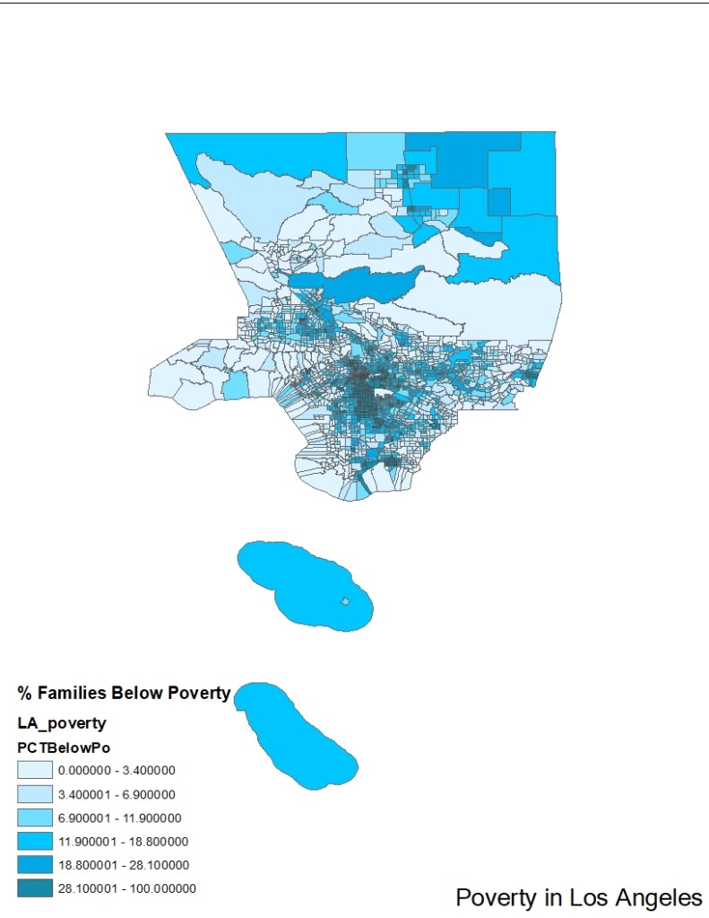
1.How many classes are in your map? What’s your classification scheme? Why? Where your thresholds dividing those classes were?
6 Classes in quantile, chosen by arcmap. I chose quantile due to a relatively even distribution of the data and wanting to emphasize the relative differences in areas of poverty versus areas of lower poverty.
2.How did you come up with your symbolization scheme?
The symbolization scheme was derived from the fact there were 6 classes, so blue was easier to tell differences of, and a single color with shades to emphasize how the map was a gradient of different levels of poverty. It also helped to show that, since poverty values are generally concentrated, it got darker as poverty was higher and in the same general areas, with the colors lightening as you moved further away.
3.Are you pleased with the result? What would you do differently if you were to remake this map?
I’m pleased with the result mostly, I could have tried a double-color classification scheme but the combinations I tried did not seem to work very well.
4.What patterns of poverty and wealth are revealed by your map? Where are the poorest and wealthiest areas of Los Angeles?
The poorest areas are concentrated in the city center mostly near each other, and the richer areas are by the coasts and generally further away from the center except where there are smaller city areas in the outskirts.
